Category: Before and after editing

  • Five Minutes

    Five Minutes

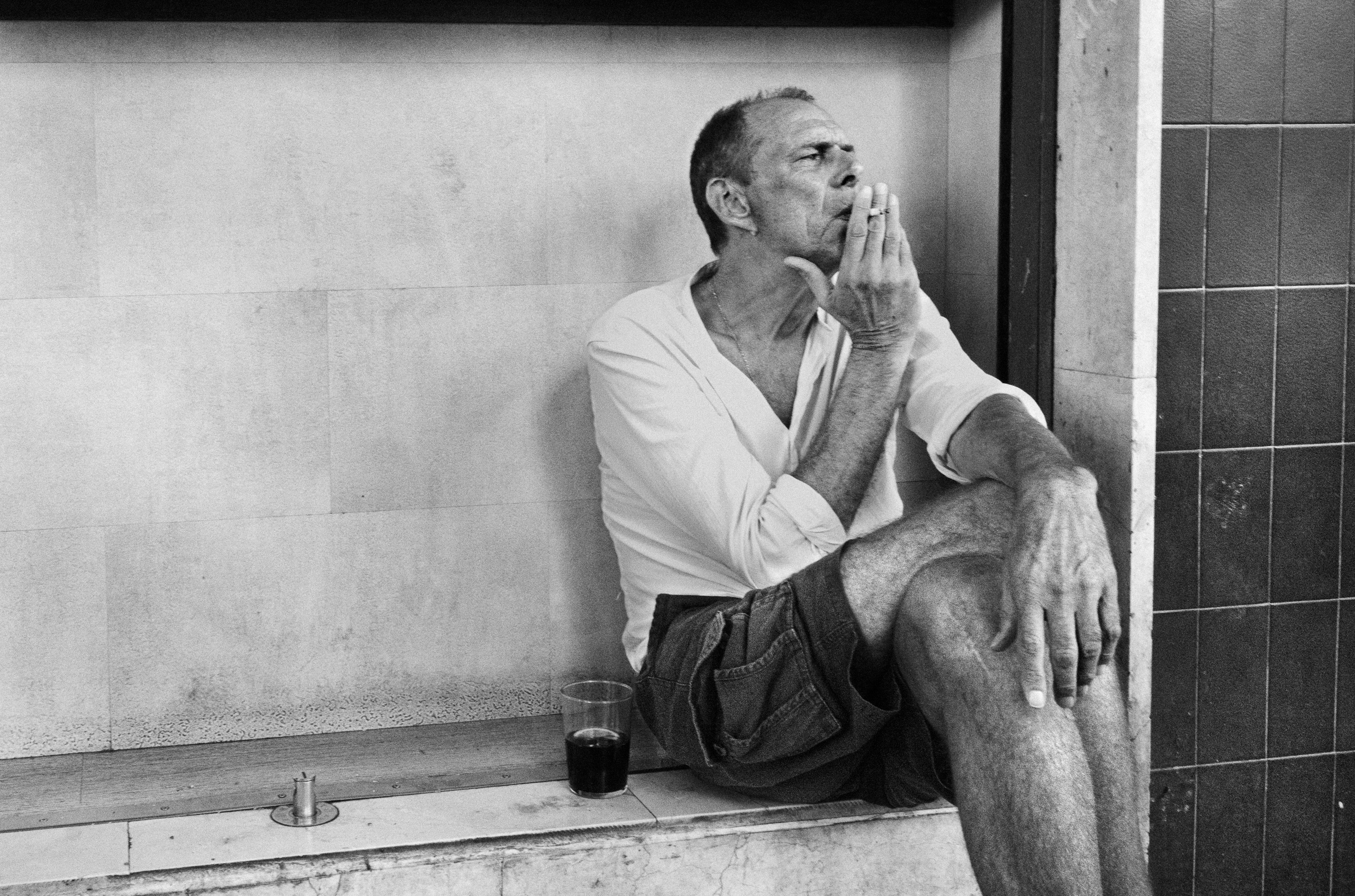
    There is too much empty space on the left.

    At least, that is the first thing you could say about this photograph.

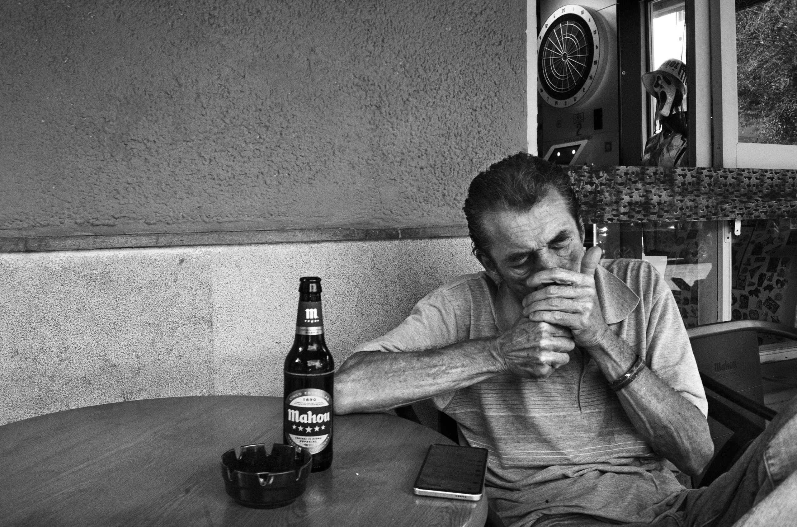
    The man is pushed well over to the right, almost trapped between the edge of the frame and the dark vertical line behind him. The wall takes up far more room than seems reasonable. A cleaner composition would probably crop some of it away.

    I tried that.

    It became tidier. And worse.

    That empty wall is doing more than I first thought. It slows the photograph down. The man seems heavier because of it. More fixed in place. There is the cigarette, the glass, the bent leg, the hand hanging down. Nothing dramatic. Just five minutes, perhaps. Maybe less.

    The RAW file was much flatter. The whites were getting away from me, especially the shirt and the wall. His face and arms did not separate enough from the rest of the scene. Everything was there, but it was all speaking at roughly the same volume.

    So the edit was mostly about deciding what should stay quiet.

    I pulled the highlights back, gave the skin and clothes more weight, deepened the darker parts and left the wall alone. I did not want detail everywhere. I did not want to “fix” the empty space either.

    Most importantly, I kept the awkward composition.

    The final frame is darker, rougher and less polite than the RAW. Good. The photograph needed that.

    The space on the left still looks excessive.

    It should.

  • The weight of empty space

    The weight of empty space

    I know. There’s a lot of wall.

    If your first thought was that I should crop some of it away, I can see why. The man is over on the right, almost everything seems to happen around him, and the left side looks rather underemployed. But every time I look at this photograph, I want to keep that space.

    He’s lighting a cigarette. His head drops towards his hands, his arms close around the gesture, and for a moment there’s this little knot of concentration. That’s where I look first. He doesn’t need to be in the middle to hold my attention. The face and hands are already doing quite enough.

    A man sitting at a table, holding his hands close to his face, appears contemplative. Next to him is a bottle of Mahou beer on the table and a smartphone. The scene is in black and white.

    The thirds grid helps, up to a point. The man sits around the right vertical; the bottle and ashtray are closer to the left one. Nothing lines up with mathematical precision. Fine by me. I use the grid to see the distribution more clearly, and I get suspicious when it starts being offered as proof that a photograph works. Plenty of dull photographs obey the rules impeccably.

    What matters more here, I think, is the triangle. One corner is down by the ashtray and bottle, another is up at the mask, and the third is towards the lower right, at the outer limit of the man’s body. It’s a broad shape that gathers much of the action into one area. The diagonal from the ashtray to the mask runs through the man’s head; the base returns across the lower part of the scene. His face sits within that arrangement. It isn’t one of the three corners.

    The bottle does a fair bit of work, too. It’s dark, quite solid, easy to pick out against the wall. With the ashtray, it gives my eye somewhere to go on the left before returning to the hands. Take those objects away and the balance would be much harder to hold. A small thing can carry a surprising amount of weight in a photograph.

    And then there’s the wall. Still there, taking up all that room.

    For me, that emptiness gives him a certain solitude. There’s space beside him that nobody fills, while he’s absorbed in this very small task. I’m talking about how the picture feels. I have no idea whether he felt lonely. He may have been perfectly happy and mildly annoyed with his lighter. Photographers are very good at finding existential crises in people who just want a smoke.

    A closer crop would give us more of the man and less of that odd distance around him. It might make a stronger immediate impression. I’d miss the slower part: looking at him, wandering across the table, feeling how much room is left over.

    The mask complicates things nicely. I notice his mouth almost hidden by his hands, then that other mouth wide open above him. It’s a ridiculous little pairing. He’s busy with his cigarette; the figure behind him seems to be taking the whole business very badly.

  • Before / After: Bringing Him Back

    Before / After: Bringing Him Back

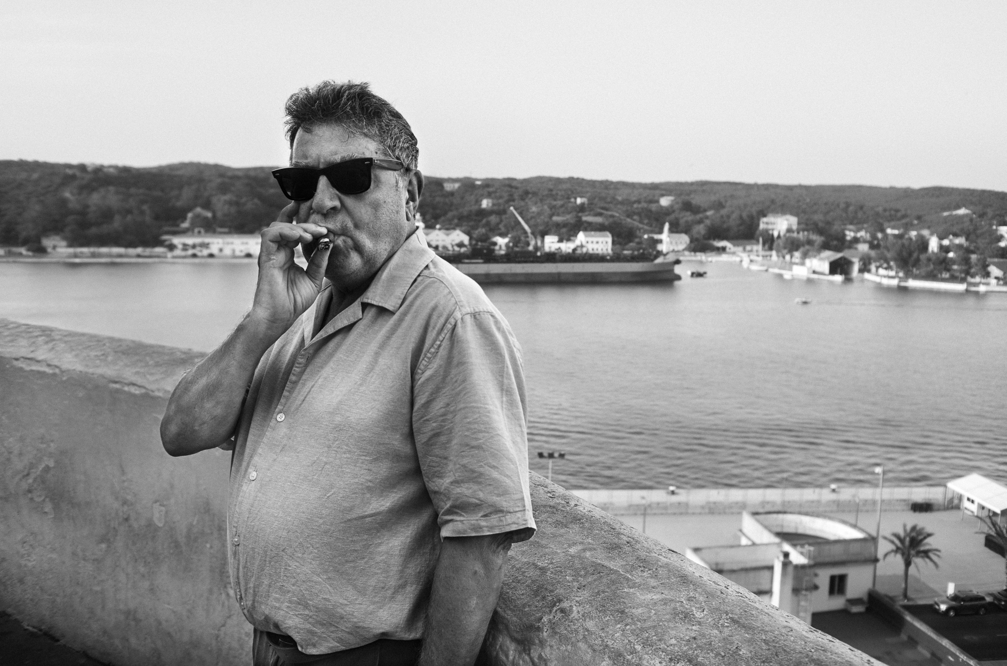
    The original was too dark. The face was almost gone, the shirt was flat and the harbour pulled the eye away. I opened the shadows, lowered the background a little, cropped tighter and added some grain. Nothing clever. Just putting the photograph where it should have been.

    And that little Brightin Star 28mm f/2.8… bloody hell. It is tiny, cheap and far better than it has any right to be. Sharp, but not sterile. Good contrast, lovely grey tones and a bit of character around the edges. I bought it out of curiosity. It keeps giving me reasons to use it.

    Leica M10 Monochrom · Brightin Star 28mm f/2.8

    Before / after editing
  • No Appointment Needed

    No Appointment Needed

    He was sitting outside an orthopaedic clinic with the relaxed authority of someone who had no intention of being repaired. I asked for a portrait. He gave me a minute and barely changed his posture—which was fortunate, because the posture was already doing most of the work.

    The background is busy: parked car, tree, signs, promises of treatment. None of it is elegant, but elegance is frequently just reality after an expensive cleaning. Here, the surroundings locate the man in the world and provide their own accidental diagnosis.

    Photographed with the Ricoh GR IV Monochrome.

    Series: Portraits

  • Liberty Takes Quarters

    Liberty Takes Quarters

    On Liberty Island, three coin-operated viewers stand in line before a horizon that was already free.

    The nearest one has all the authority: metal face, twin eyes and a small order stamped across its mouth: QUARTERS ONLY. Then a seagull crosses the frame without paying, without focusing and apparently without feeling any need to improve the view.

    The 17mm exaggerates the distance between the machines and turns the closest one into something halfway between street furniture and a minor government official. The bird arrived late and saved the photograph. Without it, this might have been a very tidy architectural exercise. A terrible fate.

    Technical: Leica M10 Monochrom · Lomography Atoll Ultra-Wide 17mm f/2.8.

    More Absurd World here.

    Before and after editing.
  • Second Opinion

    Second Opinion

    There is a trace of Absurd World here, but I would not file it twice. The man carries the photograph. The absurd part arrives later, over his shoulder, disguised as a backpack with a face.

    He looks straight at the camera. Cigarette against his chest, watch, rings, no attempt to disappear. That is where the picture holds. Then you notice the cartoon face behind him and the frame shifts slightly. Not into a joke. Just somewhere stranger.

    Technical: Leica M10 Monochrom · Leica Summicron-M 35mm f/2.

    More Portraits here.

    Before and after editing.
  • Soft Target

    Soft Target

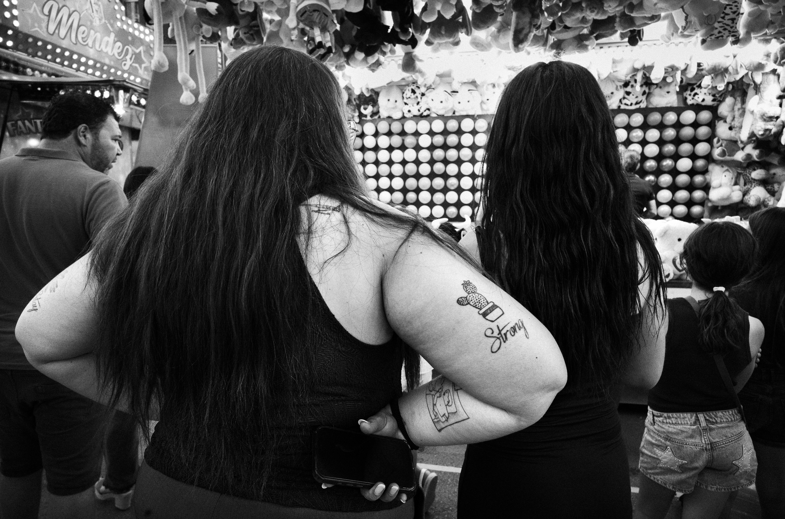
    Fairground stalls do not leave much room for looking properly. Lights, stuffed prizes, rows of white targets, people drifting in and out. Too much of everything.

    What held me was the arm.

    The woman on the left had Strong tattooed under a small cactus. A detail almost too convenient, honestly. The kind of thing that can hijack a photograph if you let it. But the gesture beside it was better: her arm around the other woman, the phone dangling behind her back as if she had forgotten it was there.

    I left the man on the left and the child on the right. They crowd the frame and make it slightly harder to read. That helped. Without them, the image becomes cleaner, more private and probably weaker. The 21mm kept everyone inside the same mess: lights, prizes, targets, bodies, waiting.

    The top of the stall is close to blowing out. The lower half nearly disappears into hair and black clothes. I could have fixed that a little. I did not. The imbalance felt right.

    The tattoo gave me the easy title. I went elsewhere. Soft Target felt less tidy, which was the point. Strength on the skin, a quiet gesture, all those targets behind them.

    Technical: Leica M10 Monochrom · Thypoch Ksana 21mm f/3.5 Asph.

    Before and after editing.
  • No Further Questions

    No Further Questions

    The picture was already there. Mostly.

    The first file was not bad. That was the awkward part. Nothing obvious needed fixing. The face was clear, the pose worked, and the background stayed more or less where it belonged. Still, everything spoke at roughly the same volume. The shoulder, the face, the space behind her. All very polite.

    The photograph is not really about the pose, though. The pose is easy. The look is not.

    She rests her head on one hand. There is a small smile, almost as if the whole situation amuses her. But the eyes hold something back. They look straight at the camera without quite giving in to it.

    That tension was already in the file. The edit just had to stop getting in the way.

    I darkened the background. Not much at first, then a little more. The hair needed weight, and so did the black top. Once those areas settled, the face began to sit where it should. Not floating. Not glowing. Just there.

    I pulled back some of the brighter skin tones too, mainly on the shoulder and forehead. They were not blown out, but they caught the eye too soon. A small adjustment around the eyes and hand was enough. More than that and the photograph started to look edited, which is usually a warning. Editing that asks to be admired has probably gone too far.

    The Nokton had already given the image enough softness, so I left most of it alone. No porcelain skin. No heroic sharpening. A face is allowed to remain a face.

    The finished version is darker, but that is not really the point. The photograph now knows where to look.

    The hair holds the right side of the frame. The hand joins the head to the body. The background finally shuts up. What remains is the slight disagreement between the smile and the eyes.

    She looks comfortable.

    I am not entirely sure she is.

    Technical note
    Leica M10 Monochrom · Voigtländer Nokton 50mm f/1.5

    Before and after editing
  • Surprise Pending: before and after editing

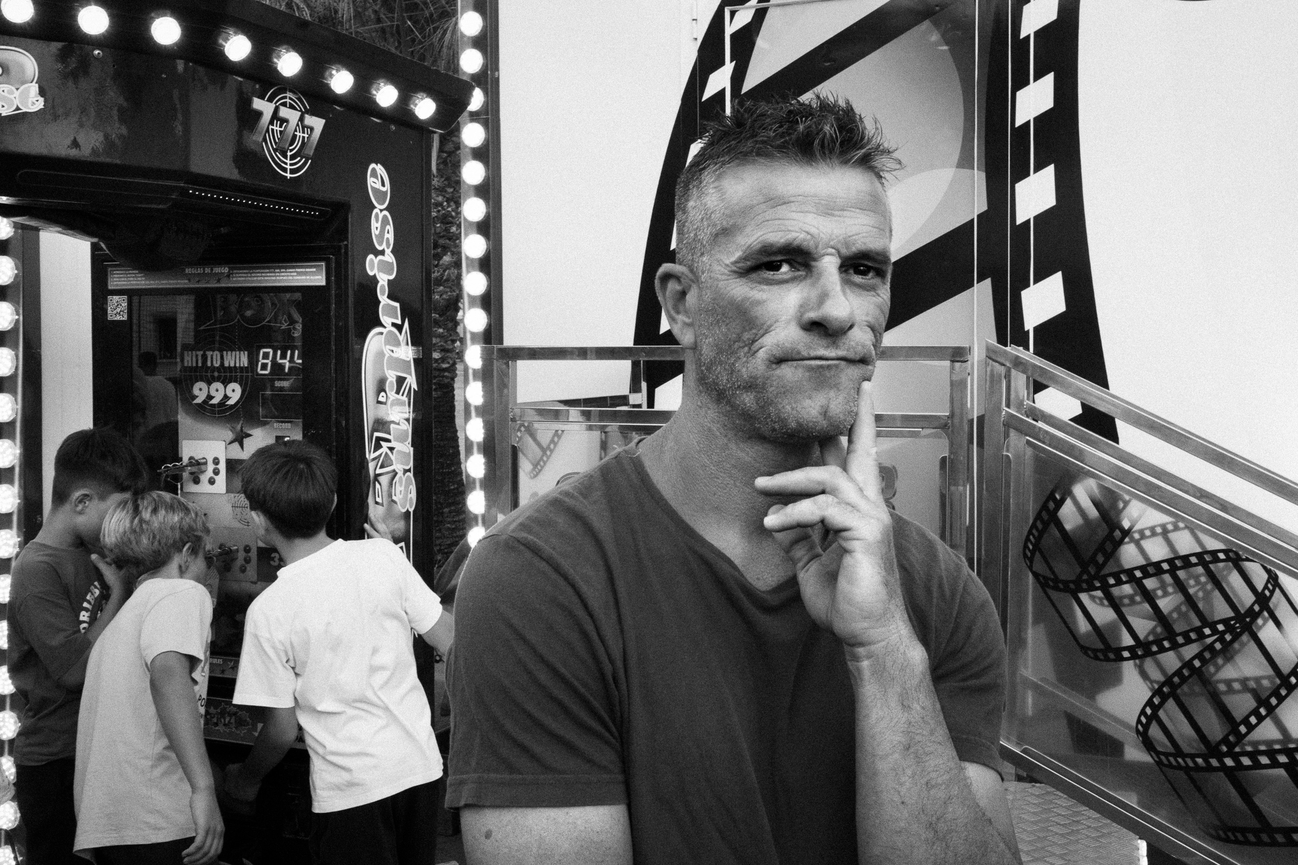
    Surprise Pending: before and after editing

    Ricoh GR IV Monochrome · Lightroom Classic