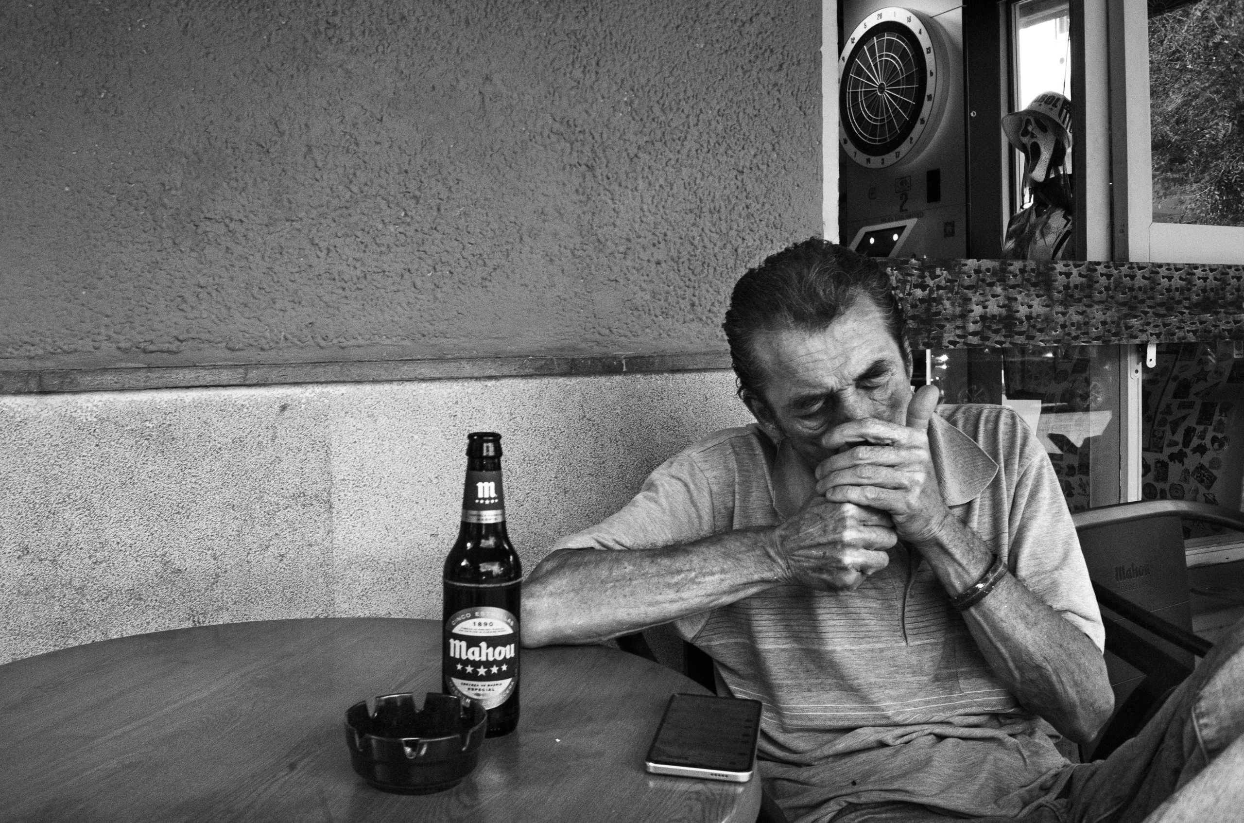
There is too much empty space on the left.
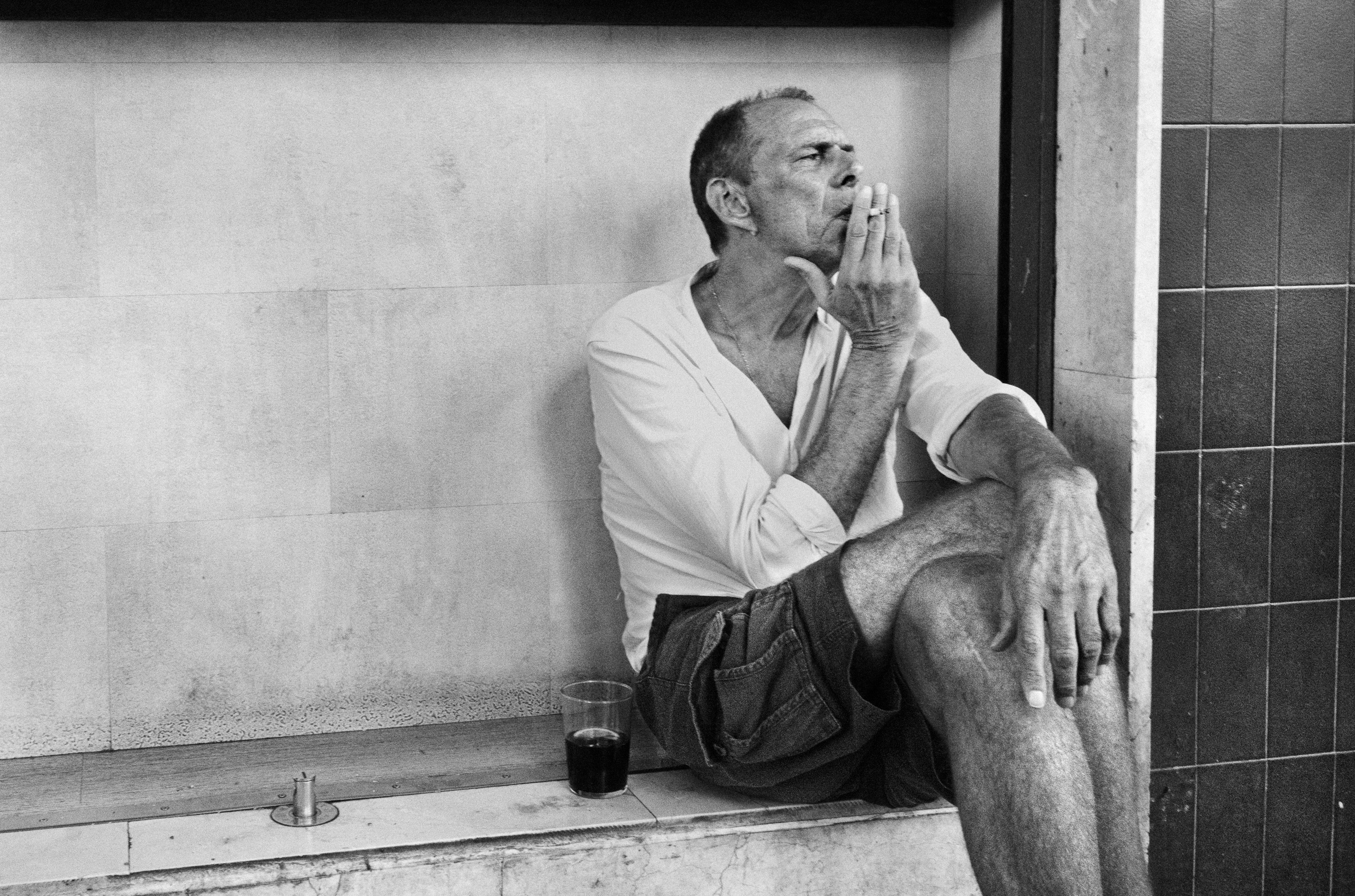
At least, that is the first thing you could say about this photograph.
The man is pushed well over to the right, almost trapped between the edge of the frame and the dark vertical line behind him. The wall takes up far more room than seems reasonable. A cleaner composition would probably crop some of it away.
I tried that.
It became tidier. And worse.
That empty wall is doing more than I first thought. It slows the photograph down. The man seems heavier because of it. More fixed in place. There is the cigarette, the glass, the bent leg, the hand hanging down. Nothing dramatic. Just five minutes, perhaps. Maybe less.
The RAW file was much flatter. The whites were getting away from me, especially the shirt and the wall. His face and arms did not separate enough from the rest of the scene. Everything was there, but it was all speaking at roughly the same volume.
So the edit was mostly about deciding what should stay quiet.
I pulled the highlights back, gave the skin and clothes more weight, deepened the darker parts and left the wall alone. I did not want detail everywhere. I did not want to “fix” the empty space either.
Most importantly, I kept the awkward composition.
The final frame is darker, rougher and less polite than the RAW. Good. The photograph needed that.
The space on the left still looks excessive.
It should.