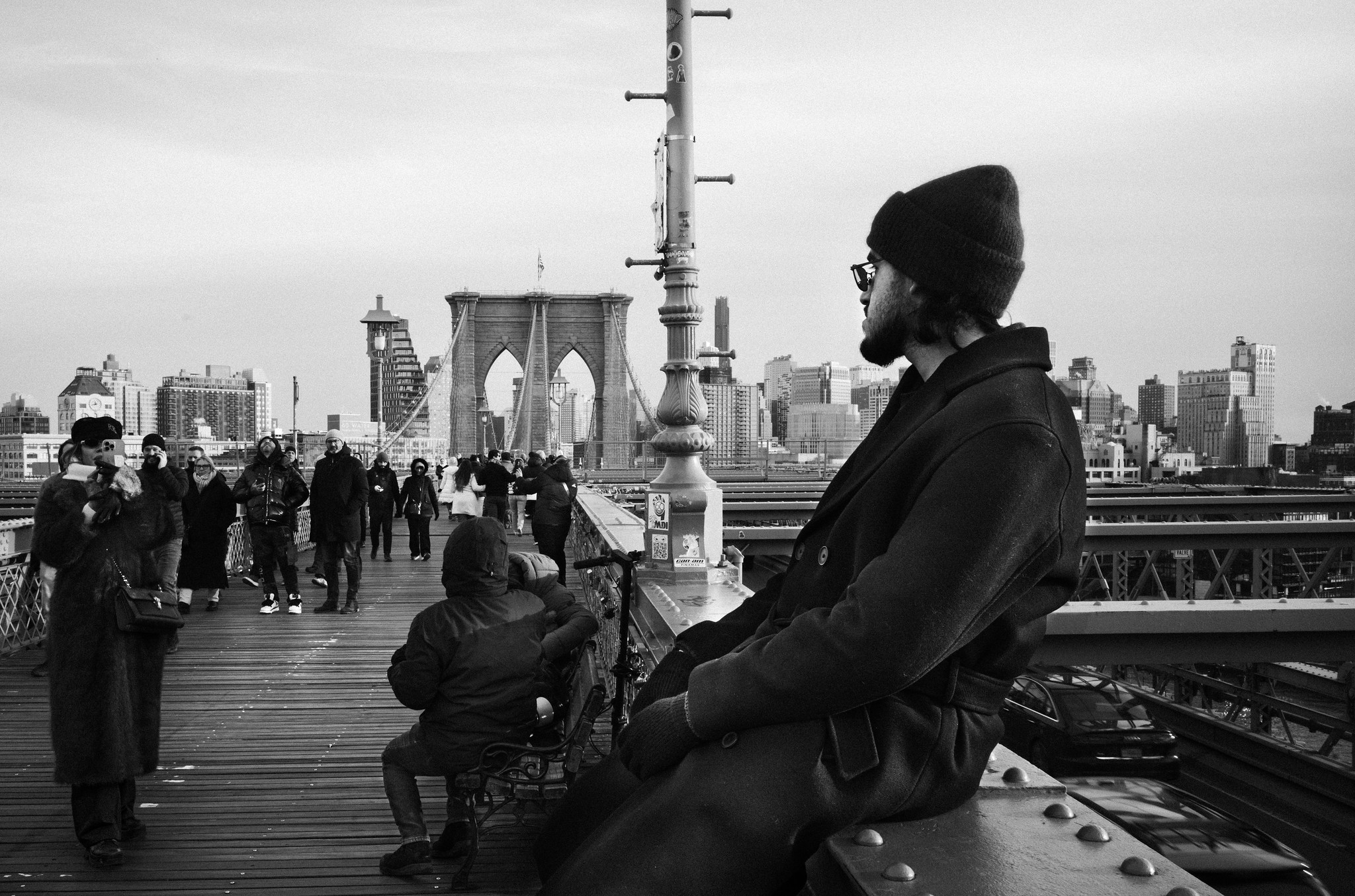
There are photographs that don’t quite seem to work when you first look at them. This one I took on the Brooklyn Bridge could be a good example. Too much weight on the right, with that enormous man dressed in black practically taking over half the frame. On the left, a woman taking a picture with her phone, someone sitting down, a handful of tourists coming and going… And in the middle, a lamppost that looks as though someone put it there specifically to annoy the photographer.
The bridge, which should really be the main subject, has been pushed into the background. It isn’t even centered.
The whole thing looks rather unbalanced. But there’s something about it that works. At least, it works for me. And when I started drawing lines over the photograph to understand why, I discovered some geometric relationships that surprised me.

For a start, the scene is structured around two large squares, the yellow one and the green one. They partially overlap, organizing the photograph into two spaces that aren’t entirely independent of each other. On the left, much of the human activity on the bridge. On the right, the man and his enormous presence. And between them, the lamppost, which turns out to play a far more important role than it first appeared to.
It’s curious, because that lamppost, which I initially saw as a nuisance, becomes something that helps hold the composition together. It’s almost in the center, but it doesn’t divide the image into two equal halves. On one side, there are lots of small figures, movement, different gestures. On the other, a single figure that carries as much visual weight as all the others put together.

The blue rectangle also helps explain how the photograph is organized. It runs horizontally across the frame and contains much of the activity, the architecture, and the human figures. Above it is the sky, largely empty. Below it, the pavement, the railings, and the elements closest to the camera.
I particularly like that empty space. Without the sky, the photograph would feel too crowded. The man on the right would seem even heavier, and everything would be compressed. Sometimes what’s missing is just as important as what’s there.

This becomes even clearer when we draw a cross that divides the photograph exactly in half, both vertically and horizontally. The vertical line coincides with the lamppost, while the horizontal one cuts through the scene at the level of the human figures, somewhere between the buildings and the bodies. The two lines meet right at the center of the frame, at a point that, curiously enough, has no particular importance.

The magenta lines help us see the triangular relationship between the woman taking the photograph, the upper-right corner, and the lower part of the composition. The diagonals cut across the scene, creating tensions that, although not immediately obvious, help hold everything together.
And these aren’t the only diagonals at work. The railings, the joints in the pavement, the angle of the man’s body, and the perspective of the bridge all lead the eye in different directions. Some pull us into the distance. Others bring us back to the foreground.
All of this happens without us necessarily being aware of any of these lines when we look at the photograph.
There’s something worth saying here, though. With enough patience, you can find triangles and squares in almost any photograph. I’m not particularly interested in this obsession with proving that an image is good because you can fit some geometric shape into it. Even less so when we end up finding golden ratios everywhere. Sometimes it seems photographers need a mathematician’s permission to take a picture.
What interests me is whether these lines explain something we actually perceive when we look at the photograph without any markings drawn over it.

In this case, I think they do.
The man on the right is by far the figure with the greatest visual weight. His dark coat, his proximity to the camera, and his sheer size make him almost impossible to ignore. But on the other side, there’s a collection of figures, contrasts, and small gestures that counterbalance him. Particularly the woman with the phone. She’s much smaller, but her dark silhouette, so close to the left edge, has considerable strength.
Besides, the man is looking to the left. Into the photograph. The direction of his gaze pulls us back into the space that his body seems to have taken over. If he were looking out of the frame, I suspect the composition would be a very different matter.
Then there’s the depth, which is no small thing. The railings and the pavement lead us toward the bridge, while the different groups of people are arranged on successive planes. There’s a certain confusion to the scene, as there usually is on the street, but the eye can move through it without getting lost.
Despite appearances, all of this comes down to experience and intuition. In street photography, you don’t have much time for these compositional calculations. You see something, you have a feeling that the pieces fit together, and you press the shutter. Sometimes you get it wrong. Quite often, actually.
Later, back home, you can look at the photograph again, this time without rushing. And discover that something you worked out intuitively had an underlying structure you couldn’t have explained at the moment you took the picture.
Perhaps that’s why I enjoy analyzing certain photographs this way. With this one, for example, after spending quite some time looking at the squares and diagonals, I find myself returning to the two people at opposite ends of the frame. The man, sitting on the railing, watches what’s happening on the bridge. The woman, on the other side, is taking a photograph. Between them, people keep walking, each minding their own business.
And the lamppost is still there, planted right in the middle. It still annoys me a little.
Leave a Reply